Building the zeitgeist of Airspace unification

This is the story of Indrajaal.
The brand, the philosophy, the identity.

Structure. Control. Integration.

Each product, each
touchpoint - built to
reflect sovereignty.

Unifying Sovereign Airspace

Only sovereign and autonomous airspace can withstand the demands of the future. We’re on a mission to build that.
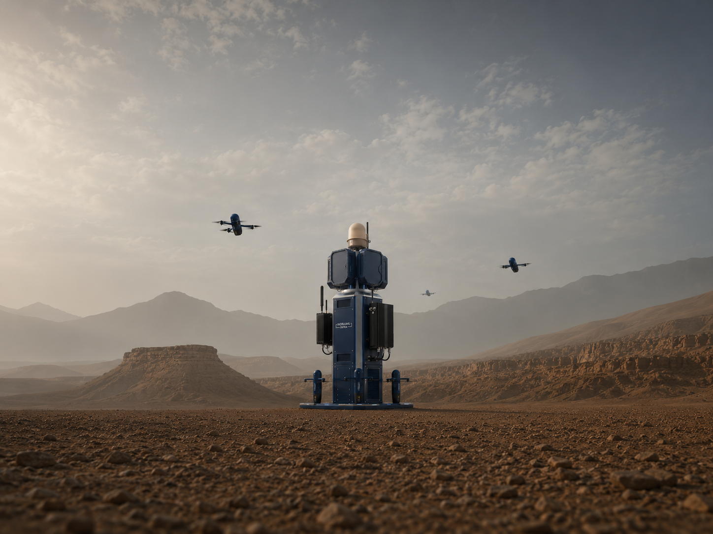
Indrajaal autonomous airspace defence system deployed in a desert landscape with drones overhead

The hexagonal principle
is our touchstone.

Inspired by nature, intensified with technology.

IJ-SYS  ///  Active

AUTONOMOUS
AIRSPACE CONTROL

28.6139°N / 77.2090°E AUTONOMOUS VOL. 01
BRAND ESSENCE
01
Name & Origin
ElementMeaning
IndraGuardian of the skies (Sanskrit)
JaalA net, a shield
IndrajaalA protective web cast across the heavens
Indrajaal signifies deliberate protection of sovereign airspace.
02
Messaging Hierarchy
PriorityMessage
PrimarySecuring Sovereign Airspace
SecondaryAutonomous Airspace Infrastructure
TertiaryAnti-drone / Counter-UAV / Air Mobility
Indrajaal secures sovereign airspace through autonomous airspace infrastructure. This is not a tagline. It is a communication constraint system.
03
Critical Positioning Rule
We are not a drone company.

We are a system that controls
the airspace.
Clarity > Creativity
SECONDARY LOGO
IJ Mark Reverse
IJ Mark — Reverse
IJ Mark
IJ Mark — Colour
USAGE CONTEXT

The secondary mark is used where the primary logotype requires visual balance — sub-brand applications, co-branding, and compact-format media.

  • Sub-brand & product lines
  • App icons & favicons
  • Embossed & watermark media
  • Co-branding lockups
VARIATIONS
Logo Black Black
Logo White White
IJ Mark Mark
IJ Mark Reverse Mark Reverse
CLEAR SPACE
Indrajaal Logo
1x 1x 1x 1x
SPECIFICATION

Maintain clear space equal to the cap height of the wordmark on all four sides. No graphic elements may intrude this zone.

XCap height of 'INDRAJAAL'
Min1× on all four sides
Digital24 px minimum
Print6 mm minimum
MINIMUM SIZE
220px
220 px  /  55 mm Optimal
140px
140 px  /  35 mm Acceptable
80px
80 px  /  20 mm Minimum
40px
40 px  /  10 mm Too Small
NOTE —  Never reproduce the logo below 80 px digital or 20 mm in print. Use the icon-only mark for constrained contexts.
BACKGROUNDS
Logo on Navy
Deep Navy Preferred
Logo on Cobalt
Deep Cobalt Approved
Logo on Black
Black Approved
Logo on White
White Approved
Logo on Grey
Light Grey Approved
Logo on Olive
Olive Green With Care
DON'TS
Distorted
Don't stretch or distort
Rotated
Don't rotate
Recoloured
Don't recolour
Low contrast
Don't use on conflicting backgrounds
Shadow
Don't add drop shadows
Too small
Don't reproduce below minimum size
PRIMARY PALETTE
TINTS & SHADES
Navy
#0C213F
90%
80%
60%
40%
20%
Base
Azure
#2669BA
90%
80%
60%
40%
20%
Base
Olive
#3A6B35
90%
80%
60%
40%
20%
Base
NEUTRAL PALETTE
White
#FFFFFF
Primary background · Text on dark
Light Grey
#DADADA
Borders · Dividers · Subtle fill
Silver
#888888
Secondary text · Disabled states
Charcoal
#222222
Dark surfaces · Print background
Black
#000000
Maximum contrast · Primary text
FUNCTIONAL COLOURS
ACTIVE
System Active
#22C55E

Confirms live operational status, real-time tracking, and successful system actions.

ALERT
Alert Status
#F59E0B

Indicates pending alerts, advisory warnings, and states requiring human attention.

CRITICAL
Critical Warning
#EF4444

Reserved for detected threats, system errors, and irreversible destructive actions.

INTEL
Intel / Information
#60A5FA

Provides supplementary data, informational links, and neutral system communications.

SPECIFICATIONS
Name HEX RGB CMYK Pantone
Deep Navy Blue #0C213F 12 / 33 / 63 81 / 48 / 0 / 75 Pantone 540 C
Deep Cobalt Blue #023877 2 / 56 / 119 98 / 53 / 0 / 53 Pantone 287 C
Azure Blue #2669BA 38 / 105 / 186 80 / 44 / 0 / 27 Pantone 286 C
Deep Olive Green #3A6B35 58 / 107 / 53 46 / 0 / 50 / 58 Pantone 364 C
White #FFFFFF 255 / 255 / 255 0 / 0 / 0 / 0 —
Light Grey #DADADA 218 / 218 / 218 0 / 0 / 0 / 15 Pantone 428 C
Silver #888888 136 / 136 / 136 0 / 0 / 0 / 47 Pantone 423 C
System Active #22C55E 34 / 197 / 94 83 / 0 / 52 / 23 Pantone 354 C
Alert Status #F59E0B 245 / 158 / 11 0 / 36 / 96 / 4 Pantone 7549 C
Critical Warning #EF4444 239 / 68 / 68 0 / 72 / 72 / 6 Pantone 1797 C
Intel / Information #60A5FA 96 / 165 / 250 62 / 34 / 0 / 2 Pantone 292 C
PRINT NOTE —  All colour values are screen-optimised. For print production, verify CMYK values against a current Pantone Colour Bridge swatch book. Pantone references are approximations only.
USAGE GUIDELINES

Build from navy. Use azure with intent. Reserve tactical colour for moments that need it.

Approved combinations
06 pairings
01 Navy + White#0C213F / #FFFFFF ✓
02 Azure + White#2669BA / #FFFFFF ✓
03 Black + White#000000 / #FFFFFF ✓
04 White + Navy#FFFFFF / #0C213F ✓
05 Navy + Azure#0C213F / #2669BA ✓
06 Olive + White#3A6B35 / #FFFFFF ✓
Colour hierarchy
Order of use
  1. 01NavyGrounds every communication.Dominant
  2. 02AzureSignals interaction and emphasis.Primary accent
  3. 03OliveReserved for terrain and tactical context.Context
  4. 04CobaltAdds depth without competing with navy.Support
  5. 05WhiteCreates clarity and negative space.Space
Proportion rule

Keep the system recognisably navy, even at a glance.

Recommended mix
Navy55%
Azure20%
White15%
Olive10%
Foundation Interaction Negative space Tactical context
PRIMARY TYPEFACE
Primary Typeface
Barlow Condensed
A B C D E F G H I J K L M
N O P Q R S T U V W X Y Z
a b c d e f g h i j k l m
n o p q r s t u v w x y z
0 1 2 3 4 5 6 7 8 9
UNIFYING SOVEREIGN AIRSPACE
Weight  —  Bold, Black  /  Uppercase Headlines
SECONDARY TYPEFACE
Logomark
Afacad
A B C D E F G H I J K L M
N O P Q R S T U V W X Y Z
a b c d e f g h i j k l m
n o p q r s t u v w x y z
0 1 2 3 4 5 6 7 8 9
Detect  /  Track  /  Neutralize
Weight  —  Bold
Monospace / Data
JetBrains Mono
A B C D E F G H I J K L M
N O P Q R S T U V W X Y Z
a b c d e f g h i j k l m
n o p q r s t u v w x y z
@ 0 1 2 3 4 5 6 7 8 9 / : ; . , ! ?
IJ-BRD-2025.04  /// v1.0
Weight  —  Regular, Medium
WHEN TO USE
  • System labels & product codes
  • Technical specifications
  • Data tables & dashboards
  • Timestamps & identifiers
  • Code & developer documentation
IJ-UAV-001  /  28°36'N 77°13'E
STATUS: ACTIVE  /  ALT: 150m AGL
LAST PING: 00:00:03  /  SIG: 97%
FONT HIERARCHY
Headlines
Barlow Condensed
A B C D E F G H I J K L M
N O P Q R S T U V W X Y Z
a b c d e f g h i j k l m
n o p q r s t u v w x y z
0 1 2 3 4 5 6 7 8 9
Detect  /  Track  /  Neutralize
Weight  —  Bold, Black
TYPE SCALE
DISPLAY SOVEREIGN Barlow Condensed / 900 / 56px
H1 DETECT. TRACK. NEUTRALIZE. Barlow Condensed / 900 / 40px
H2 Airspace Intelligence Platform Barlow Condensed / 700 / 32px
H3 System Architecture Overview Barlow / 600 / 20px
BODY Sovereign and autonomous airspace operations at scale. Barlow / 400 / 16px
CAPTION Indrajaal Autonomous Defence System Barlow / 400 / 13px
LABEL System Status Active JetBrains Mono / 400 / 11px
FONT WEIGHTS
Content / Body
Barlow
A B C D E F G H I J K L M
N O P Q R S T U V W X Y Z
a b c d e f g h i j k l m
n o p q r s t u v w x y z
0 1 2 3 4 5 6 7 8 9
Detect  /  Track  /  Neutralize
Weight  —  Regular, Medium
BARLOW CONDENSED
300Light
400Regular
600Semi Bold
700Bold
900Black
BARLOW
300Light
400Regular
500Medium
600Semi Bold
TEXT STYLES
DISPLAY
Sovereign Airspace
Barlow Condensed Black · Uppercase · −0.02em
HEADLINE
Detect. Track. Neutralize.
Barlow Condensed Black · Uppercase · Normal
SUBHEAD
Airspace Intelligence Platform
Barlow Condensed Bold · Sentence case
BODY
One platform. Total control of sovereign low-altitude airspace defence.
Barlow Regular · 16px · 1.6 leading
CAPTION
Indrajaal Autonomous Defence System — v1.0
Barlow Regular · 13px · 1.5 leading
DATA / MONO
IJ-UAV-001 · 28°36'N · ALT 150m
JetBrains Mono Regular · 12px · 0.08em
USAGE GUIDELINES
OPERATIONAL STATUS
All systems active. Monitoring 24/7.
Condensed Black + Barlow Regular
Platform Overview
Autonomous defence for sovereign airspace.
Condensed Bold + Barlow Regular
System Architecture
IJ-SYS-CORE · v2.4.1
Barlow Semibold + JetBrains Mono
✕DON'T
  • Mix Afacad with Barlow Condensed in the same heading
  • Use Barlow Condensed below 18px
  • Use JetBrains Mono for body or narrative text
  • Use font weights below 400 in display contexts
✓DO
  • Use Barlow Condensed Black for all primary headlines
  • Use JetBrains Mono exclusively for data, labels, and technical content
  • Maintain minimum 1.5 line-height for all body text
SHAPE LANGUAGE
Hexagon
Hexagon
Scalable Strength

Cellular tessellation mirrors the distributed mesh coverage of the Indrajaal network.

Arc
Arc
Grounded Vigilance

Radar sweep in geometric form. Persistent. Autonomous. Always watching.

Dome
Geometry of Control

The protective envelope. Sovereign airspace made visible as a single geometric truth.

Geometry
Geometry
Unified Form

All elements unified. The complete Indrajaal mark — system, network, authority.

Shape Principles
5 Rules
01
Angular Only

Prefer angular geometry — never organic or freeform curves.

02
Hexagon Primary

Hexagons are the primary structural motif across all formats.

03
Arcs With Purpose

Arcs must reference surveillance or sweep — never purely decorative.

04
Dome = Authority

Domes signal protection, completeness, and sovereign authority.

05
Two Shape Limit

Do not combine more than two primary shapes in one composition.

GRID SYSTEM
Margin 12 Columns Margin
1
2
3
4
5
6
7
8
9
10
11
12
← 24px gutter between each column →
Column Layout Examples
3 col
9 col
6 col
6 col
4 col
4 col
4 col
12 col — Full Width
Digital Grid
Columns12
Gutter24px
Margin40px
Base Unit8px
Baseline4px
Max Width1440px
Print Grid
FormatA4 / A3
Columns6
Gutter5mm
Margin12mm
LAYOUT PRINCIPLES
Dark-Dominant

Dark surfaces anchor 80% of all interface layouts. Dark conveys authority, precision, and operational readiness.

LIVE
Info Hierarchy

Status first, then data, then narrative. Critical operational information always occupies the primary visual zone.

ACTIVE
Bento Structure

Modular glass panels aligned to the 8px unit grid. Each panel holds a single data object or content cluster.

Asymmetric Balance

Content anchors to the left axis. Breathing space expands right. Tension creates a sense of controlled urgency.

SPACING SYSTEM
Scale Ladder
4px  —  XS
8px  —  SM
12px  —  MD-
16px  —  MD
24px  —  LG
32px  —  XL
48px  —  2XL
64px  —  3XL
96px  —  4XL
Base Unit Rule
8px
8162432

All primary spacing values are multiples of 8px. The 4px unit is reserved for optical micro-adjustments only.

Tokens

Spacing creates tactical hierarchy: tight data, deliberate component rhythm, and large separation for command-level shifts.

8px base / 4px exception
TokenValueUsageScale
--space-xs4pxIcon gaps & inner padding
--space-sm8pxElement spacing, micro gaps
--space-md16pxComponent padding, list items
--space-lg24pxCard padding, section gaps
--space-xl32pxPanel margins, group dividers
--space-2xl48pxSection spacing
--space-3xl64pxPage-level margins
--space-4xl96pxMajor section separation
Token in Use

One interface module using the spacing scale.

24px padding
8px gap
16px
24px
32px
8 inline 16 text stack 24 card group 32 next block
01 Micro 4-8px for icon gaps, labels, dense controls.
02 Component 16-32px for cards, forms, and grouped interface states.
03 Section 48-96px for narrative breaks and major page transitions.
PATTERNS & TEXTURES
01
Dot Grid

Primary background texture across all dark-surface UI. Applied at low opacity over deep navy to create depth without distraction.

18px pitch10-18% opacity
UI & Background Overlays
02
Hexagonal Mesh

Hero sections and large-format print. References the Indrajaal network topology and distributed airspace coverage grid.

Network fieldLarge format
Hero, Print, Large Formats
03
Scan Line

A CRT-inspired horizontal line overlay evoking surveillance displays and live operational dashboards. Reinforces the active-system aesthetic.

Live systemMotion safe
Digital UI, Screen Backgrounds
04
Topographic Lines

Contour lines drawn from terrain mapping data. Deployed behind critical positioning statements and large-format print collateral.

Terrain contourStatement layer
Brand Statements, Print
PRINCIPLES
Core Constraint

Capability,
not beauty.

Photography must read as operational intelligence. Every frame should prove the system, terrain, and scale without cosmetic rescue.

  • Operational context only
  • No lifestyle or stock logic
  • Neutral-cool grade; preserve detail
  • Hardware, terrain, and scale stay legible
Image direction Operational / precise / grounded / readable
Indrajaal Ranger deployment in a desert operational environment
Approved frame direction Real terrain. Equipment first. People secondary.
Rule 01Evidence

Operational truth

Real deployments, real terrain, active system context. No staged lighting, consumer polish, or stock logic.

Rule 02Exposure

Controlled darkness

Low-key palette, readable detail. Shadow should add authority without hiding the system.

Rule 03Frame

Technical precision

Use alignment, scale, and targeting discipline. Composition clarifies the system first.

Rule 04Subject

System focus

Lead with equipment and environment. Operators add scale; they stay secondary.

Rule 05Terrain

Environmental authenticity

Real weather, real ground conditions, real deployment context. No green-screen, generic terrain, or cosmetic backdrops.

PRODUCT IMAGERY
Shooting Specifications
Angle Eye-level or 7–15° overhead. Never high-angle bird's eye for primary product shots.
Lighting Single directional key light. Daylight 5500–6500K or cooler. No ring lights or fill lights visible in frame.
Background Deep navy, tactical black, or natural terrain only. No white cycs or gradient studio backgrounds.
Aperture f/5.6–f/11 for product shots. Full system must remain in focus. No hero-shot bokeh.
Format 16:9 horizontal (primary). 3:2 for print. 1:1 for social/icon applications only.
Post Grade Cool desaturated base. Blue channel +10–15. Warm tones reduced to zero. Contrast +15. Highlights −10.
Output RAW master + TIFF for print. JPEG 80% minimum for digital. 300 DPI print / 72+ DPI digital.
Treatment Comparison
Approved
Operational product frame Cool grade · dark bg · f/8 · 5600K
16:9 · Min 2400 × 1350 px
Cool grade · f/8 · Level horizon · Dark bg · 5600K
Not Approved
Studio product frame Warm grade · white bg · studio · 3200K
16:9 · Min 2400 × 1350 px
Warm grade · White bg · Studio light · 3200K
ENVIRONMENT STYLE
Indrajaal Ranger system deployed in open desert terrain with drones overhead
27.4N / Open Terrain
Context 0116:9 / 5600K

Outdoor deployment

Open terrain, visible horizon line. Dusk or pre-dawn preferred. Equipment anchored in the foreground against a wide environmental backdrop.
Low horizonForeground anchor
Indrajaal command centre at night with illuminated operations displays
Ops Room / Monitor Glow
Context 02Near-dark / cool grade

Command & control

Interior, near-dark rooms with monitor glow as the primary light source. Operators appear as silhouettes only; no faces, no expressions.
Blue source lightSilhouettes only
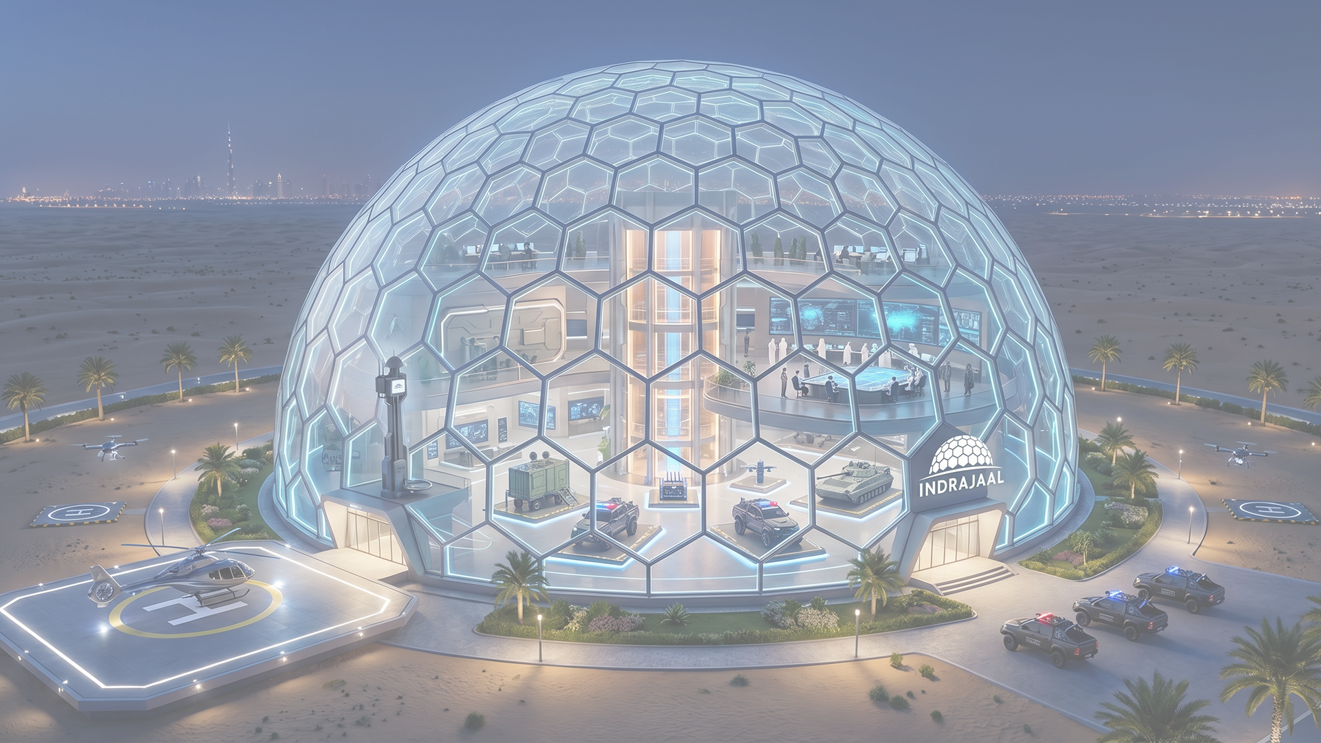
Indrajaal command dome set against an urban skyline at twilight
High Vantage / City Grid
Context 03Twilight / overcast

Urban surveillance

Rooftop-level vantage. Dense city grid below. High elevation establishes system authority over the urban landscape.
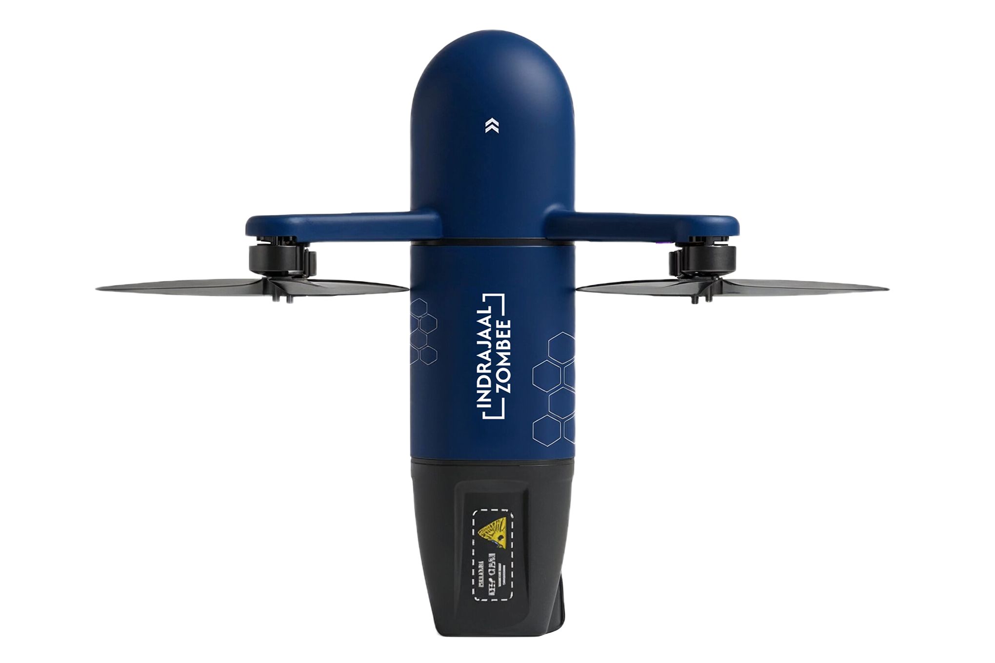
Elevated frameDense backdrop
Indrajaal Ranger field vehicle with roof-mounted drone equipment
Field Unit / Dust Grade
Context 04Documentary / rough terrain

Field operations

Dust, earth, and genuine tactical conditions. Terrain-anchored framing shows the system operating in the real world.

Operational grit
COMPOSITION RULES
Indrajaal Ranger deployment framed with composition guidance overlays
Primary frame 04 rules active

Every image reads likea controlled operating frame.

Grid, vector, horizon, and depth are checked before a frame enters the system.

01Grid discipline

Rule of thirds

Place subjects at grid intersections. Command frames stay centred.

02Mission vector

Lead room

Frame into motion. Keep two-thirds of the image in front of the movement.

03Stability line

Horizon parallel

Keep horizon lines level. Stable system, stable frame.

04Spatial proof
SKY MID GROUND

Depth layering

Layer foreground, midground, and sky to establish operational depth.

Icon Style

Phosphor is the system source. Use Regular by default; reserve Bold for primary actions and navigation.

24px canvas 20px live area Rounded caps 2px trim
Grid Rules

Build on 24×24. Keep marks inside a 20×20 live area and snap every point to whole pixels.

12px
16px
24px
32px
48px
Stroke Style
Regular
Interface & body
Bold
Nav & CTAs
Fill
Alerts & active states

Rule One component, one weight. Match weight to hierarchy.

Illustration Language
Build with
  • Technical geometry
  • Radar, sweep & signal arcs
  • Hard, grid-aligned edges
Avoid
  • Organic or fluid shapes
  • Decorative gradients
  • Isometric perspective
Core symbol library

Operational concepts, drawn from one consistent system.

24approved
symbols
1Shield
2Tower
3Broadcast
4CPU
5Crosshair
6Scan
7Warning
8Eye
9Compass
10Globe
11Lightning
12Database
13Lock
14Robot
15Airplane
16Transfer
17Monitor
18Map Pin
19Terminal
20Sliders
21Search
22Bell
23Network
24Map
UI COMPONENTS
Design Tokens
SPACING
4px--sp-1
8px--sp-2
12px--sp-3
16px--sp-4
24px--sp-6
32px--sp-8
RADIUS
2px--r-xs
4px--r-sm
8px--r-md
12px--r-lg
20px--r-xl
pill--r-pill
Colour Roles in UI
SurfaceNavy — base background
Surface RaisedCobalt — elevated panel
Primary ActionAzure — CTA, links, focus
On-SurfaceWhite — text, icons
MutedSilver — secondary text
Status — ActiveGreen — operational
Status — AlertAmber — attention needed
Status — CriticalRed — threat / error
Elevation System
0Base SurfaceNo shadow
1Resting Card0 1px 4px / 30%
2Raised Panel0 4px 12px / 42%
3Floating Layer0 8px 24px / 55%
4Modal / OverlayGlow border
Border Language
0.5px / 20%Dividers
1px / 40%Cards
1px + pulseFocus / Active
1.5px AzureSelection
1px dashedPlaceholder
Radius Scale
2
6
12
20
∞
BUTTONS & FORMS
Interaction standard / v1.0

Actions stay explicit. Inputs carry clear hierarchy, visible state, and operational consequence.

01
Actions

Button hierarchy

One dominant action per view. Secondary states recede without losing legibility.

07 states
02
Inputs

Operational form

Group controls by decision, keep labels persistent, and expose active states at a glance.

Live specimen
Toggle states
Active Monitoring
Stealth Mode
Selection states
0m500m
CARDS
01 Glass data Telemetry
Sector 7 — Active S7 / DEL-N
47 Contacts
↑ 12 from last sweep
Signal94%
Tracked airspace68%
Known31
Unresolved13
Hostile03
02 Status System
System Active
NODE / 004
IJ-Node 004
North grid relay · New Delhi perimeter
Coverage98.4%
Latency12 ms
Uptime99.97%
Active sensors12 / 12
Processing capacity72%
03 Alert Critical
CRITICAL ALR-031
Unauthorised Entry
Target IJ-UAV-119 entered restricted zone Alpha-4. Automatic intercept initiated.
TargetUAV-119
ZoneAlpha-4
Confidence96%
ResponseAutonomous intercept
ENGAGED
14:32:05Detected 14:32:06Classified 14:32:07Engaged
04 Metric Analysis
Threats Neutralised
ROLLING / 30D
1,284
↑ 18.3% this month
Today42
01 Jun15 Jun30 Jun
MTD delta+198
Daily avg.42.8
Avg. response2.4s
DASHBOARD STYLE
Dashboard Threat Map Sectors Reports
DEL-N / Shift 03
IJ-SYS Active
Operational overview

New Delhi perimeter grid

08 sectors watched 4s last sync A-7 response protocol
Threats neutralised+18.3%
1,284
Rolling 30 days
Active contacts+12
47
Across 08 sectors
Coveragestable
98.4%
Critical alertsopen
03
1 intercept active
Airspace activity — 24h
Live feedUTC+05:30
23 intercepts 6.4 km radius 96% confidence
Threat log
Priority4 events
UAV-119Zone α-4 · intercepting 14:32
UAV-084Perimeter · watching 14:30
UAV-051Cleared · route logged 14:28
UAV-033Cleared · no action 14:24
Response queue Autonomous intercept Protocol A-7 · engaged
Dashboard Principles

Screen contract

Every operations dashboard follows the same priority stack: threat state first, operator action second, reference data last.

  • 01Critical firstHighest-priority information sits in the first read zone.
  • 02Colour is stateFunctional colours only; alert red is never decorative.
  • 03Dense, not noisyCompress metadata, but keep action targets and values legible.
  • 04Mono for dataUse tabular numbers for IDs, coordinates, and timings.
  • 05Dark-firstAll command surfaces are designed for dark operational contexts.
DATA VISUALISATION
Bar Chart — Threat Frequency
60 40 20 0 M T W T F S S M T W Standard Critical
Area Chart — Sensor Coverage
100 50 0 Coverage % Response %
Donut Chart — Threat Classification
1,284 TOTAL
Critical — 28%
Alert — 35%
Active — 22%
Intel — 15%
Radar Chart — Sector Performance
DETECT TRACK COVER RESPOND UPTIME RANGE
Sector A Performance
Visualisation Principles
01Use functional colours only — Critical → Red, Alert → Amber, Active → Green, Data → Azure.
02All numerical labels use JetBrains Mono. No serif typefaces in data contexts.
03Axes are minimal — 0.5px dividers at 6–10% opacity. Never decorate with heavy gridlines.
04Use filled areas sparingly. Prefer strokes with subtle fills (opacity ≤ 35%).
INTERACTION PATTERNS
Component States
Default
System Overview
Hover
System Overview
Active
System Overview
Focus
System Overview
Disabled
System Overview
Loading & Skeleton States
RULE —

Skeleton screens use a 1.5s shimmer sweeping navy → cobalt. Never use spinners for data-heavy panels. Shimmer direction is always left → right.

Transition Timing
Instant
0ms Status pulses
Snap
80ms Button press, icon swap
Fast
150ms Hover, colour shift
Default
250ms Panel open, expand
Slow
450ms Modal, slide-in
Reveal
600ms Section entrance
Easing Curves
Deceleratecubic-bezier(0.0, 0.0, 0.2, 1)
Standardcubic-bezier(0.4, 0.0, 0.2, 1)
Acceleratecubic-bezier(0.4, 0.0, 1.0, 1)
Springcubic-bezier(0.16, 1, 0.3, 1)
Micro-Interaction Rules
  • Glow pulse — active status indicators use a 3s ease-in-out infinite animation. Amplitude subtle: opacity 50→100%.
  • Scanline hover — cards exhibit a top-to-bottom light sweep on hover. Duration 1.8s linear.
  • Glitch on load — icons may use a single 350ms glitch on mount. Used sparingly — max 1 per viewport.
  • Odometer count-up — key metric values animate from 0 on first viewport entry. Duration 1.2s decelerate.
  • No elastic easing — bounce curves are prohibited. Indrajaal interactions are precise and deliberate.
  • No decorative loaders — never use animated illustrations as loading states. Use skeleton screens or the progress bar only.
TIMING SYSTEM
Duration Tokens
--dur-instant
0 ms Threshold events, status ping
--dur-snap
80 ms Button feedback, icon swap
--dur-fast
150 ms Hover state, colour transition
--dur-default
250 ms Panel open, accordion expand
--dur-slow
450 ms Modal, drawer, slide-in panel
--dur-reveal
600 ms Section entrance, hero reveal
--dur-cinematic
1200 ms Page transition, brand film
Stagger Rules
01 — DETECT
02 — TRACK
03 — NEUTRALIZE
04 — REPORT
Offset80 ms per child
Max items6 (cap at 480 ms total)
Base delay0 ms (immediate start)
OverrideCritical alerts: no stagger
EASING CURVES
Decelerate
Default Entry
cubic-bezier(0.0, 0.0, 0.2, 1)

Objects arrive with speed and settle softly. Use for all enter animations — panels, modals, cards, overlays.

  • Panel / drawer enter
  • Card scroll reveal
  • Modal appearance
Standard
State Change
cubic-bezier(0.4, 0.0, 0.2, 1)

Symmetric ease in/out for elements that change state without entering or leaving the screen.

  • Colour transitions
  • Size change
  • Tab / toggle switch
Accelerate
Default Exit
cubic-bezier(0.4, 0.0, 1.0, 1)

Elements exit with growing speed — they don't linger. Dismissals and closes use this curve to clear space promptly.

  • Modal dismiss
  • Toast removal
  • Panel close
Spring
Hero / Brand
cubic-bezier(0.16, 1, 0.3, 1)

Aggressive initial deceleration for high-impact reveals. Reserved for hero elements, page transitions, and brand moments only.

  • Hero text reveal
  • Page enter
  • Brand intro
Bounce curves are prohibited. Elastic easing (back-out, elastic-out, bounce) is never permitted. Indrajaal motion is precise and militarily deliberate — objects do not overshoot their targets.
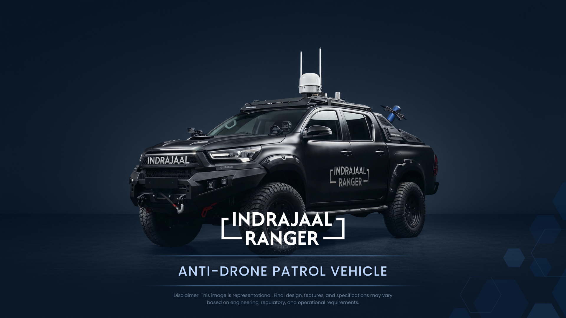
PRESENTATION DECK
Indrajaal Deck — Title Slide
Title Slide
Deck Usage Rules
  • Format16:9 widescreen only. Never 4:3 or custom dimensions.
  • Title typeBarlow Condensed Bold, uppercase, white on dark field
  • Body typeBarlow Regular 16–18pt, rgba(219,235,255,0.8) on navy
  • BackgroundDeep navy (#0C213F) or gradient field only. No white slides.
  • AccentAzure (#2669BA) for highlights, rule lines, and CTAs only
  • LogoReverse lockup, lower-right corner, ≥ 24mm wide at print
  • ImageryOperational photography only — apply photography guidelines
  • TransitionsFade or appear only. No fly-in, bounce, or spin transitions.
Slide Variants
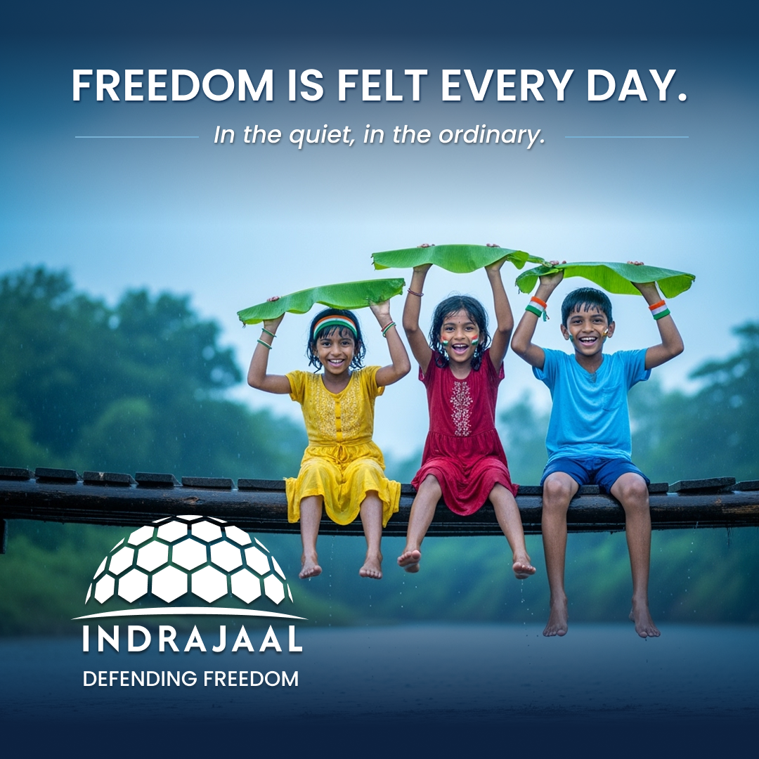
SOCIAL MEDIA
LinkedIn Card 1:1
Social & Digital Specifications
LinkedIn1200 × 1200 px (1:1) feed · 1200 × 628 px (1.91:1) article banners
Instagram1080 × 1080 px (1:1) feed · 1080 × 1920 px (9:16) story
Twitter / X1200 × 675 px (16:9) in-feed cards · 1500 × 500 px header
BackgroundNavy (#0C213F) or Cobalt (#023877) only. No white or off-brand fills.
Logo lock-upReverse logo always. Minimum 12% of frame width.
TypographyBarlow Condensed for headlines. Min 32pt equivalent at native resolution.
ColourAzure and white as accent only. No additional tones in social posts.
File outputPNG for static · MP4 H.264 for video · 4:1 min contrast on all text
Card Variants
MERCHANDISE & CARDS
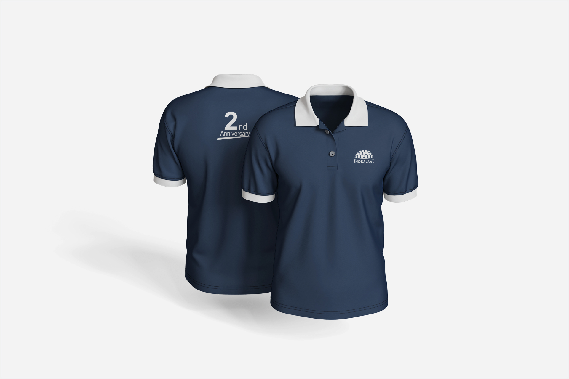
Primary Application — Apparel
Indrajaal Polo Shirt
Apparel Application Rules
Base coloursNavy, black, charcoal, or white. Avoid warm neutrals and bright garment colours.
Logo useReverse lockup on dark surfaces. Monogram may be used when the full lockup is too small.
PlacementChest, sleeve, strap, lid, or lower-corner placement only. No oversized decorative centre marks.
FinishEmbroidery, deboss, woven patch, matte print, or spot UV. No gloss coating unless specified.
TypographyBarlow Condensed for names or labels. Barlow Regular for role, contact, and usage copy.
ApprovalAll merchandise and collateral proofs require logo-size, contrast, and placement review before production.
Application Variants
SIGNAGE & SPATIAL
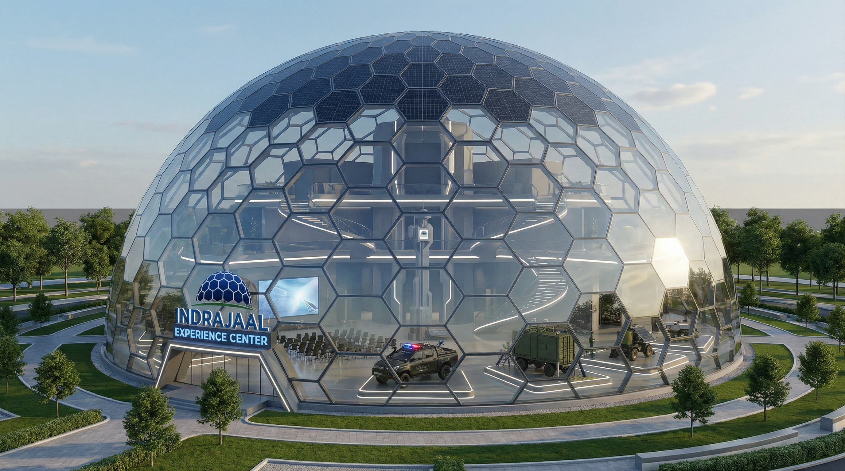
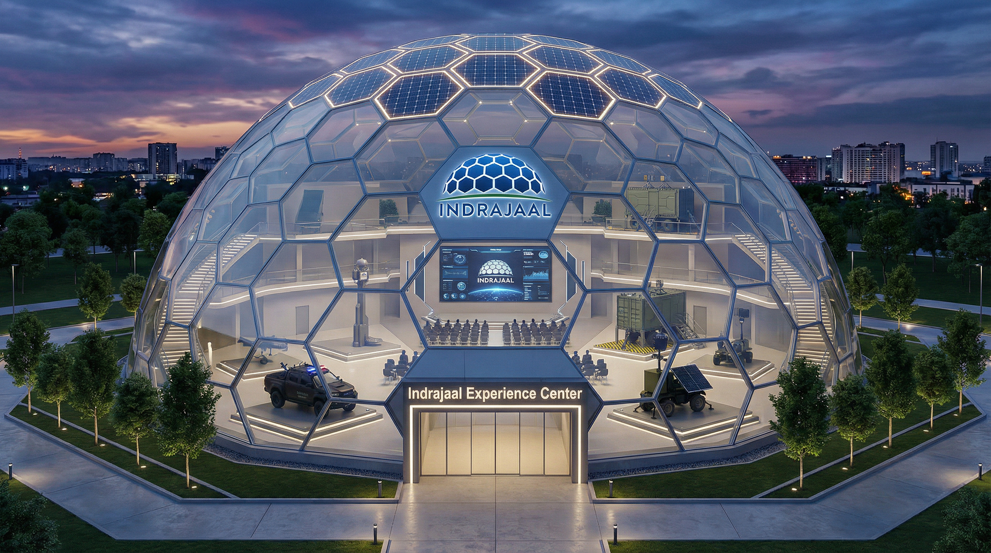
Indrajaal Experience Centre — Exterior
Experience Centre — Exterior
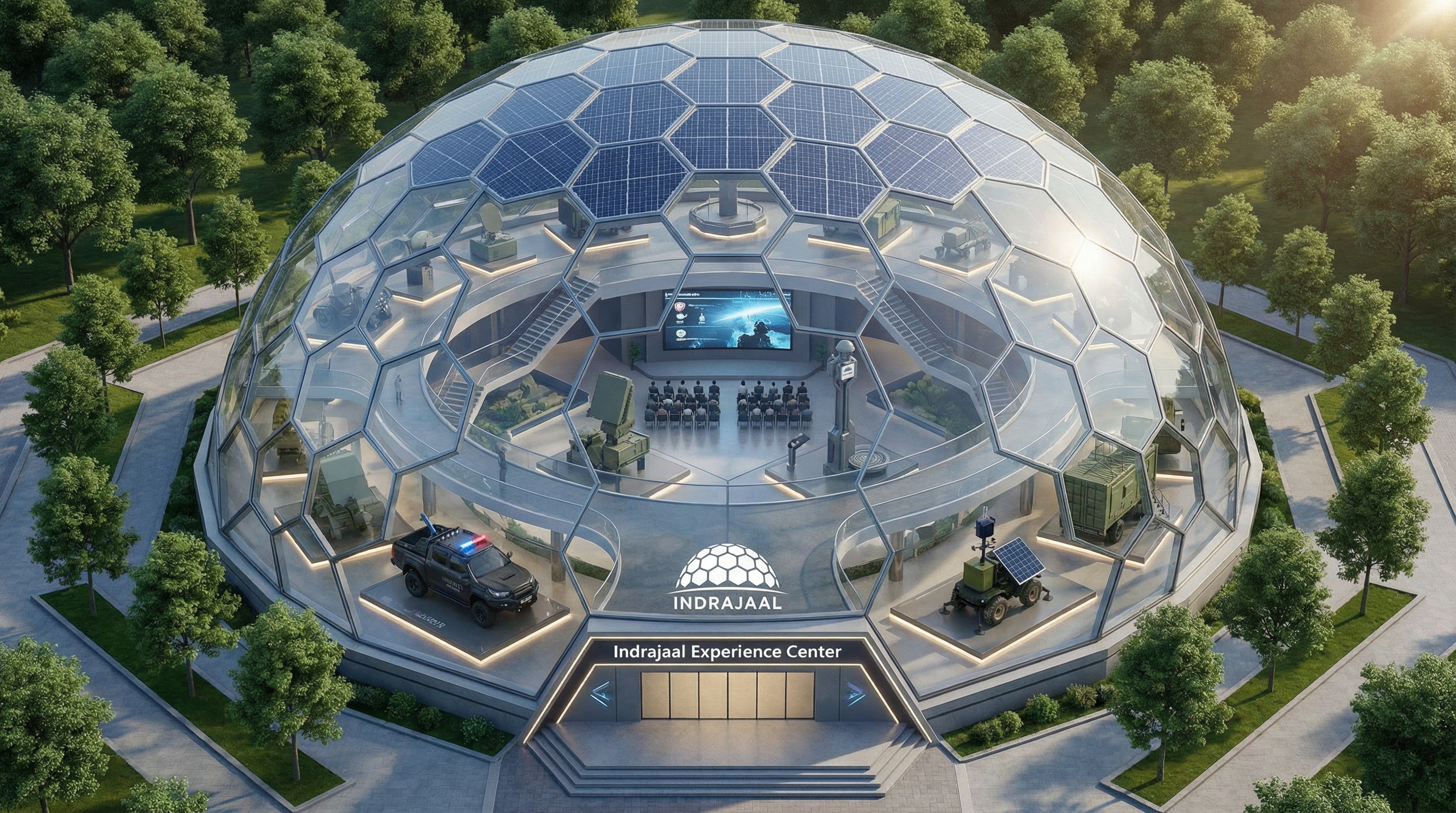
Indrajaal Experience Centre — Facade
Experience Centre — Facade
Signage & Environmental Specifications
Outdoor fasciaReverse logo on illuminated navy panel. Logo height ≥ 300 mm for primary fascia.
IndoorFull lockup or monogram by space. White on dark surfaces; navy on light.
VehicleVinyl wrap: reverse lockup on doors, full logo on bonnet. No consumer vehicle sticker kits.
Banners2400 × 800 mm roller: full logo top-right, headline Barlow Condensed, operational image background.
WayfindingMonogram only in tight spaces. 20 mm clear space minimum. Azure (#2669BA) as directional accent.
MaterialsBrushed aluminium, backlit acrylic, or 3M-grade vinyl. No foam-board or consumer-grade substrates.
IlluminationCool-white LED 5000–6000 K. No warm-toned or RGB lighting.
CO-BRANDING
Indrajaal Mark INDRAJAAL
PARTNER
LOGO
Clear zone = 2× monogram width  ·  Divider: 1 px at 40% opacity
Indrajaal mark appears first and larger in every configuration
All co-branded executions require written authorisation from Brand & Comms
No third-party mark may enter the Indrajaal exclusion zone
Spacing & Scale
Min separation2× IJ monogram height between marks at all sizes
Divider1 px vertical rule, rgba(139, 203, 255, 0.4), required horizontally
Size ratioIndrajaal logo ≥ 120% of partner logo height
PositionIJ always left in LTR layouts; top when stacked
Exclusion zoneEach logo keeps its own protected clear space
BackgroundsNavy (#0C213F) or Cobalt (#023877). No partner colour fields.
Usage Rules
  • HierarchyIJ leads in position, scale, and reading order.
  • ColourUse approved white/dark or primary/white versions only.
  • TypographyEach brand keeps its approved typeface stack.
  • ModificationsDo not redraw, distort, recolour, or place marks on competing fields.
  • ApprovalDigital, print, spatial, and broadcast work needs sign-off.
  • ScopePermissions are single-project and non-transferable.
DO
Lead with IJ
IJ
PARTNER

IJ leads left or top. Partner mark stays ≤ 80% of IJ height.

DO
Dark Field Only
IJ
PARTNER

Use only Navy (#0C213F) or Cobalt (#023877) fields.

DON'T
Partner Dominates
PARTNER
IJ

Partner mark is never equal to or larger than IJ.

DON'T
No Colour Merge
IJ
PARTNER

No partner colours in the IJ field. Marks stay independent.

RESOURCES
Primary Logo System
Monogram & Mark
Colour Profiles
Font Specimen
Web Font Kit
Icon Library
Presentation Templates
Document Templates
Email Signatures
Full Brand Guidelines
Quick Reference Card